
.png)


Client: Grup Eina Digital
Context: Currently, the third-party tool for applying and managing tests is outdated, confusing, and presents difficulties in finding content.
Solution:
A unified platform for students, teachers, and administrators, with multiple information search options accessible according to user type. Results statistics are presented grouped by workshop, topic, or geographically, depending on each client's organizational structure.
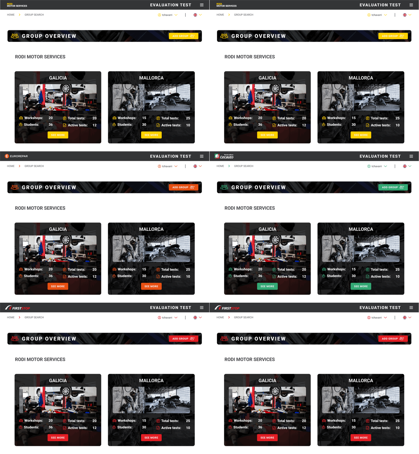
A simple design is proposed, capable of adapting to the graphics of various clients in terms of color; the main objective is to keep the large volume of information being handled clear.
Goals:
Modernize UI
Rethinking UX to facilitate the search for and access to information
Create a platform adaptable to different brands (third-party tool)
Work experience
Initially, the architecture is presented with only one search method (forms and results in tables), and there is a clear lack of resources when it comes to finding information and organizing it in a way that is understandable to the user.
We've added several more user-friendly search and organization methods called "Overviews," where admins can easily find groups or workshops. Similarly, students can view their Overviews grouped by the topics they've studied and the overall ratings for their workshop group (if the client prefers).
The Overviews also include, as a new feature, ways to view statistics and trends of student results and behavior; within each group, information can be viewed by workshops or by tests.

Ancient architecture

Example Overview page proposal
Work experience
Given the large volume of information handled in both administrative and educational content, a visually simple interface has been chosen where the main objective is for the information to be clear and understandable. For this same reason, the search forms are grouped by topic and the results table view is displayed in two phases (compact and full) to save the user scrolling.

Otra de las necesidades del proyecto es que Evaluation Test es una plataforma diseñada para terceros, por lo que la gráfica debía ser adaptable, de alguna manera, a la imagen corporativa de cada cliente. Se opta por una paleta de colores grises como tono principal y se define un color de acento que es personalizable para cada cliente.
Key points:
Design focused on clarity of information.
A highly customizable platform for each client; it is necessary to define organizational modes, user roles, and graphic details before implementation.
Creation of the “Overview” space as a search and organization tool.